X by Y visualizes all submissions to the prix ars electronica, from the early beginnings in 1987 up to 2009. The goal is to characterize the "ars world" in quantitative terms. A series of diagrams groups and juxtaposes the submissions by years, categories, prizes and countries. The graphics are composed of little dots (each representing a single submission) to provide a visual scale for the statistical statements and thematize the relation of the totality and the individual.
In collaboration with the Ludwig Boltzmann Institute for media.art.research
Exhibited at ars electronica 2009: History Lounge
Approach
Click to view
All submissions
Click to view
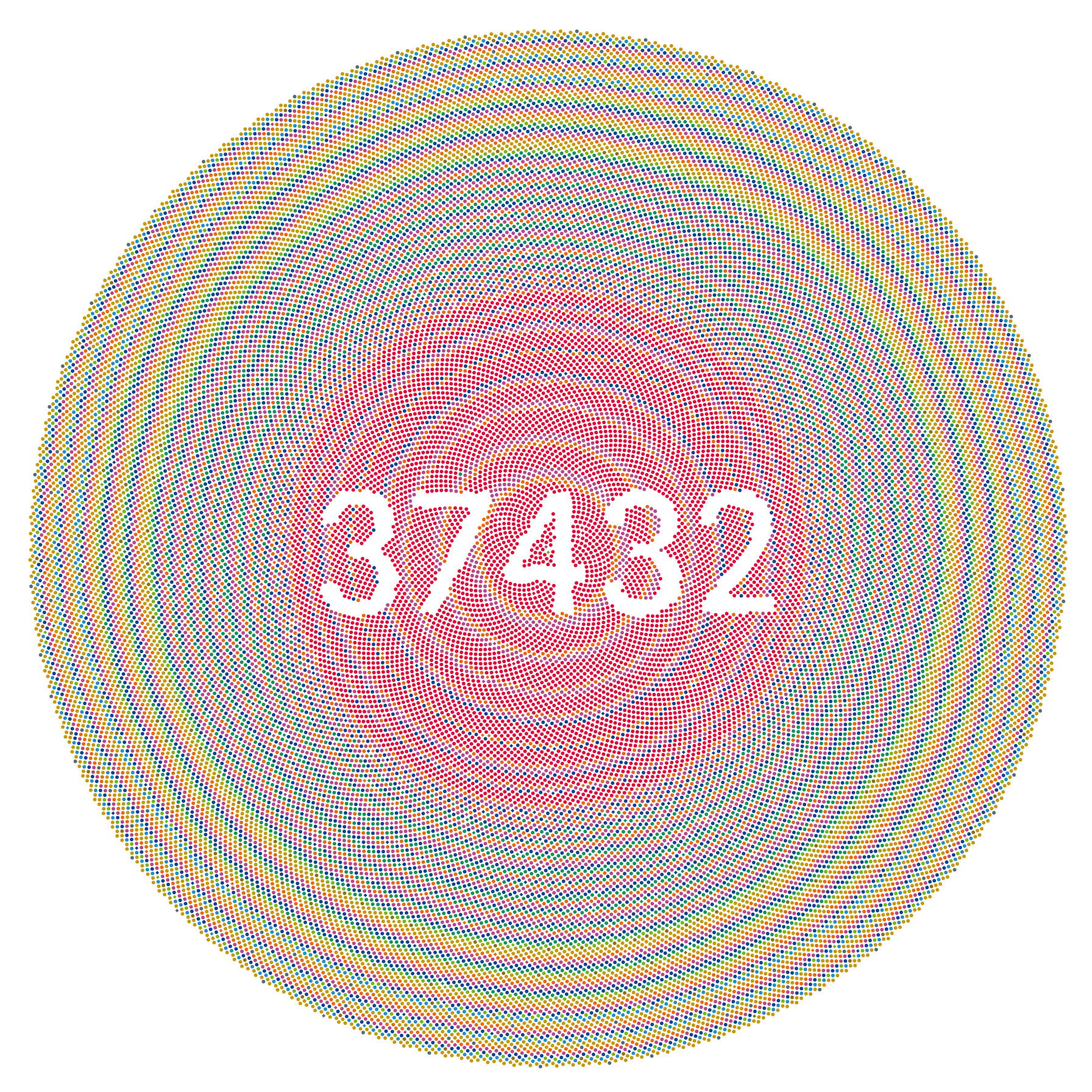
This graphic shows all submissions to the prix ars electronica over the last 22 years. Each dot symbolizes one submission. Resembling a tree cross–section, the oldest submissions are located at the center, surrounded by more recent ones. It constitutes the starting point for all the other graphics, which are a split-up version of this one, analyzing the data according to different criteria.By Prize

Click to view
This diagram is enough motivate the whole project: Splitting the submissions by the prize received (or not) reveals that only 4% of all submissions has received an honorary mention, distinction or a Golden Nica. The remaining 96% remained invisible – up to now.By Country
Click to view
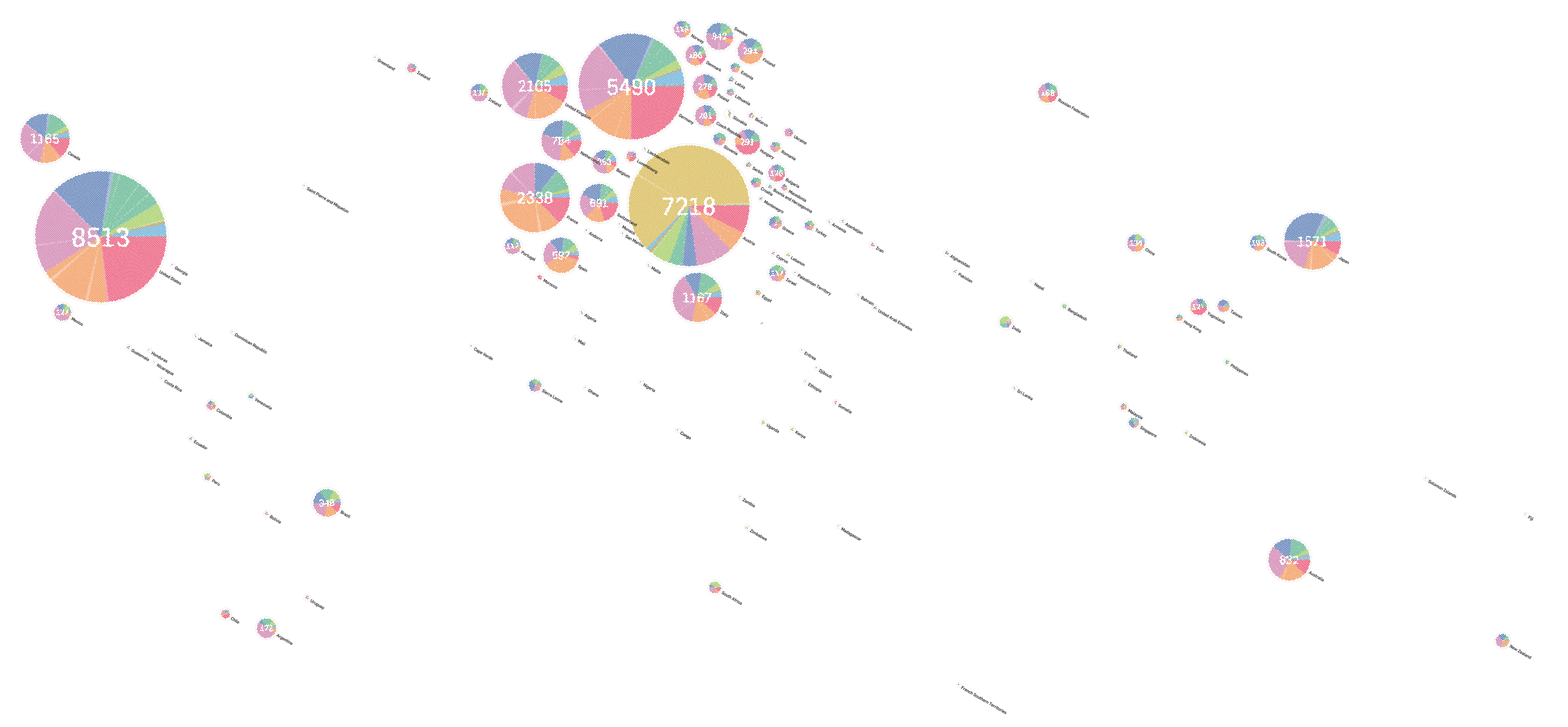
A map diagram of the submitters' countries of origin. Inspired by the New York Times' map of olympic medals, the layout is calculated with a physical rigid body model, trying to approximate the exact locations, while avoiding circle overlap. The whole of eastern europe was manually positioned, however, as things were pretty messed up there.
Inspecting the map in detail reveals the Euro/US-centric nature of media art, with very few contributions from South America, Africa, Russia and Asia - except Japan. A large number of submissions from France and Spain were in the field of computer animation and film (orange). Italy, Sweden and UK show a tendency towards music categories (purple), while Japan seems more into interactive art (blue). In contrast, Germany and the US lean towards Computer Graphics in the early years of the festival (red). Almost a two thirds of Austria's submissions stem from the (Austrian-only) U19 categories.
By Category
Click to view
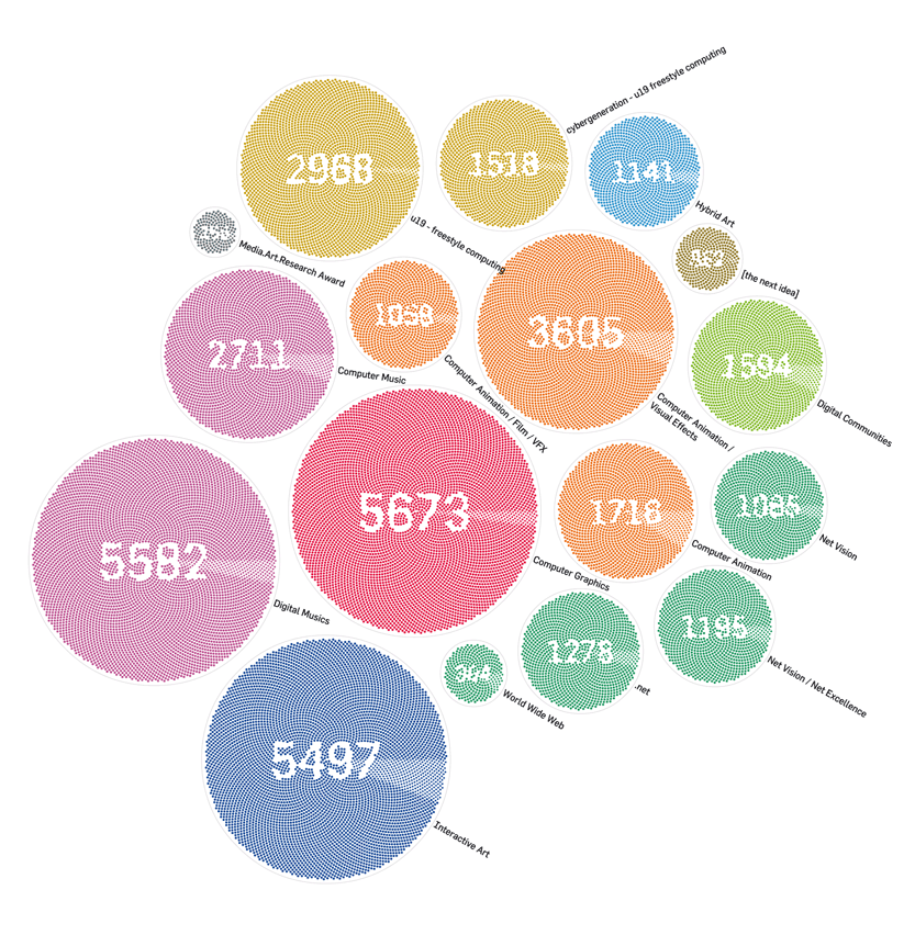
A quantitative analysis of the submissions by category. At the same time, it provides a sense of the fraction of awarded projects per category - the fainter pie, composed of diamond shapes in the right of each circle. Although being around for only 7 years, the computer graphics category has the highest number of submissions overall (unless we combine Computer Musics and Digital Musics).By Year

Click to view
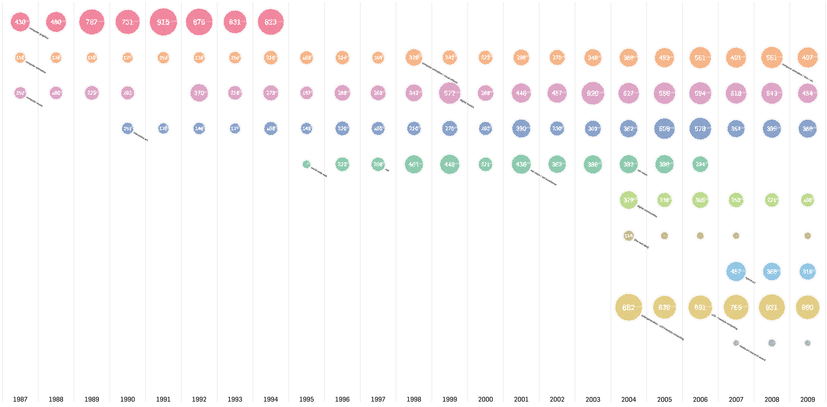
This sequence of pie charts shows a clear division of the prix history in three eras: in 1995, the Computer Graphics category was discontinued - instead, the "world wide web" category entered the scene, leading to a sudden decrease in submissions (one possible reason: in the Computer Graphics category, it was more common to submit multiple pieces per year). The years after 2004 show a stronger diversification in categories, and a sudden increase in submissions, which is largely due to the u19 categories for Austrian artists under 19.By Year and Category
Click to view
A matrix version of the timeline, to provide an inspection of the development of individual groups of categories. Both in color coding and the row selection, we decided to group corresponding categories, although their titles were changed over the years. (Conversely, it should also be noted that some categories with identical names had different orientations in different years.) Compared to the pie chart, it is easier to see how animation/film, music and later interactive art have become the long term backbones of the prix.All together now

Exhibition


