Visualizing information flow in science
Eigenfactor is a non-commercial academic research project by the Bergstrom lab in the Department of Biology at the University of Washington. The goal is to map the structure of science. Together, we are developing different visualizations based on citation patterns between scientific journals.
Citation patterns

This visualization gives an overview of the whole citation network. The colors represent the four main groups of journals, which are further subdivided into fields in the outer ring. The segments of the inner ring represent the individual journals, scaled by Eigenfactor™ Score. In the initial view, the top 1000 citation links are plotted. Line size and opacity represents connection strength. The Bezier curves follow the hierarchical cluster structure, using the hierarchical edge bundling technique (pdf). Selecting a single journal (inner ring) or whole field (outer ring) displays all citation flow coming in or out of the selection. The color is based on the cluster color of the origin node.
Change over time

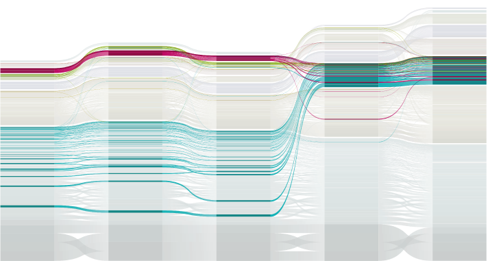
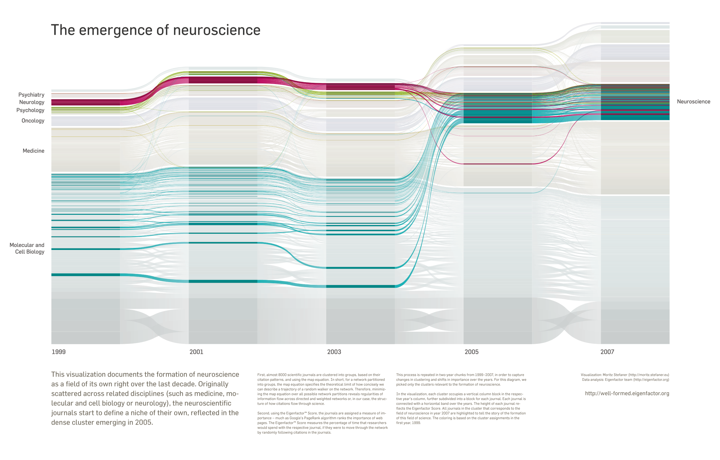
Inspired by Sankey diagrams and stacked bar charts, this diagram displays changes in Eigenfactor™ Score and clustering over time. The columns corresponds to the years 1997, 1999, 2001, 2003 and 2005. In each year, the journals are grouped vertically according to their cluster structure; within a cluster, they are ordered by their Eigenfactor Score. Bars belonging to the same journal are connected. Clicking highlights both the selected journal over the years, and all clusters it has been part of. This allows to track both changes in journal influence as well as changes in cluster structure. You can see, for instance, the Astrophysical Journal change its cluster from 1997 to 1999.
Clustering

This visualization displays a hierarchical clustering of journals in the form of a treemap. The size of a journal marker corresponds to its Eigenfactor™ Score. Click one of the squares in order to see the amount of citation flow from other journals. The black arrow indicates outgoing citation flow (from the selected journal), the white one incoming citations. The arrow size indicates the amount of citation flow.
Map

This map visualization puts journals, which frequently cite each other, closer together. You can drag the white magnification lens around to enlarge a part of the map for closer inspection. Clicking one of the nodes will highlight all its connections. If a journal is selected, the node sizes represent the relative amount of citation flow (incoming and outgoing) with respect to the selection; otherwise, they are scaled by their Eigenfactor™ Score.
All visualizations were built with flare

Wired Infoporn
WIRED UK magazine featured a remix of one of the well-formed.eigenfactor visualizations in their infoporn section. Together with my colleagues in Seattle and Umea, I modified the "change over time" visualization to tell a specific story: The formation of neuroscience as a field of its own right over the last decade. Originally scattered across related disciplines (such as medicine, molecular and cell biology or neurology), the neuroscientific journals start to define a niche of their own, reflected in the dense cluster emerging in 2005.
Powerdome projections

An adapted version runs in the Powerdome in Potsdam, a large fulldome environment for immersive interactive experiences.