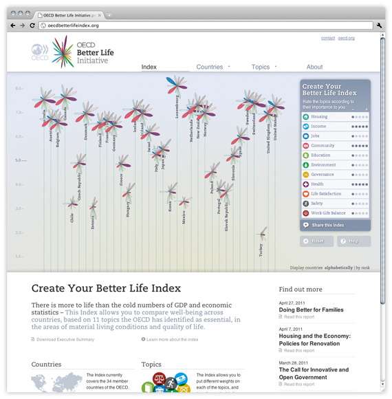
Launched on the occasion of the 50th anniversary of the OECD, the Better Life Index aims at comparing the world's well-being beyond traditional, material measures like GDP. I was responsible for the interactive visualization of this new approach to ranking countries, which also provided the central theme for the branding of the initiative as a whole.

The flower concept
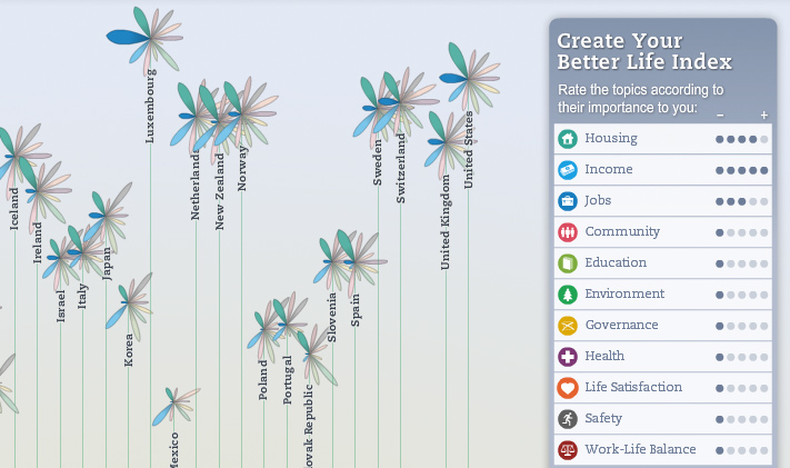
Your Better Life Index is designed to let you visualise and compare some of the key factors – like education, housing, environment, and so on – that contribute to well-being in OECD countries. It’s an interactive tool that allows you to see how countries perform according to the importance you give to each of 11 topics that make for a better life.
Each country is represented by one flower, one topic by one of its petals. The length of a petal indicates the score of the respective country in that topic (e.g. income in Germany). If we add up all scores, we get a toal score for each country. The higher the score, the higher the flower will rise.
A personalized index
Users can interact by putting different weights on the indicators, for instance, making life satisfaction more important. Now, the respective petal will become broader and more saturated, while the other petal are taken back a bit. Also, the influence of life satisfaction on the total score will change, which in turn might bring about changes in the ranking.
The resulting personal indexes and rankings can be shared and discussed on the web. For the OECD, this can provide an important back channel to get in touch with people and learn about the topics they are really interested in.
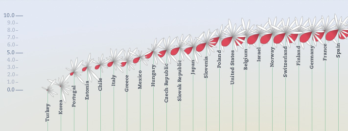
In addition to the playful index weighting tool, there is plenty of in-depth information on the individual topic and country pages. Here, the visualization shows a variant highlighting the respective topic or country.
In addition, information dense sparkline charts show the ranking of all countries according to the indicators.
Design alternatives
If you are interested in the design process, here is a screengrab of some of the alternatives we explored:
PS: While I worked on the design and implementation of the visualization, the branding, web design and site production was handled by Timm Kekeritz at Raureif and Jonas Leist.