The Church of London commissioned me to remix two of the famous Gapminder bubble graphics to illustrate an interview with Hans Rosling for Google's "Think Quarterly" Magazine.
Fertility and life expectancy
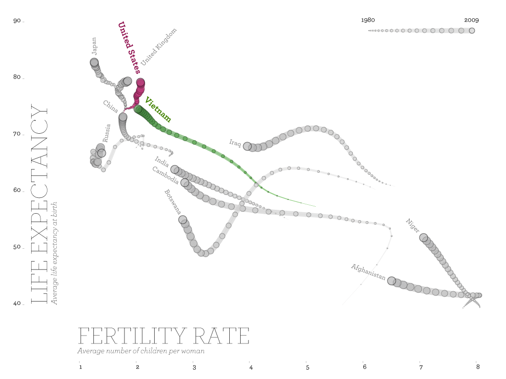
This graphics is a condensed, and static version of one of Gapminder's famous animated "worm" graphics. Scaling the diameters of the circles according to the years, and then connecting them, induces a sense of motion over time, even in this static image. It is fascinating to see how Vietnam is today on the same level as the US in 1980 with respect to the fertility rate and life expectancy. Also note how the dip in Botswana's curve reflects the drastic effects of AIDS in this country in the 1980s.
Child mortality

This chart dramatically shows how Bangladesh manages to reduce its child mortality with a rate faster than Sweden ever did. In the background, the mortality rates of all countries are plotted in light grey lines, in order to provide a sense of the density and distribution of the data over the years. Note how measurements seem to fluctuate strongly before the 1950s.